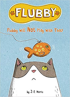
Kami and her cat Flubby star in these two titles. In Flubby Is Not a Good Pet, Kami notices that all her friends' pets have special talents (i.e.: singing, jumping, playing catch), and she wonders what Flubby's special ability might be. Meanwhile, in Flubby Will Not Play with That, Flubby stubbornly refuses to play with any of the toys Kami bought at the pet store. Let's see how these books could be evaluated using some of the Geisel criteria:
Subject matter must be intriguing enough to motivate the child to read; The plot advances from one page to the next, and together with the illustrations, creates a "page-turning" dynamic
Pets (and their talents) always a popular topic for young readers, and Flubby's repeated failure to meet Kami's expectations will keep them turning the pages to see what Flubby can do (spoiler alert: he manages to please her at the end of both stories). The cat's actions and expressions add lots of visual humor, too.
New words should be added slowly enough to make learning them a positive experience;
Words should be repeated to ensure knowledge retention
 Both books excel in this area. In Flubby Is Not a Good Pet, one new word is added as each of Kami's friends arrives, and that same word is repeated several times over the next few pages (see photo). In Flubby Will Not Play with That, words follow a pattern each time Kami tries (unsuccessfully) to get Flubby to play with a toy, always ending with, "It is fine. I have another toy."
Sentences must be simple and straightforward;
This is also a strength; most sentences are only 3-4 words long and fit on one line.
The book must also contain illustrations, which function as keys or clues to the text
Both books have a mix of full page illustrations and easy-to-follow panels. In Flubby Is Not a Good Pet, the illustrations make excellent clues; as new words are introduced, they are almost always pictured. Generally this is also the true in Flubby Will Not Play with That, but there are a few cases where text placement could work better. For example, on page 11, the text reads, "This toy rolls," but the action of rolling does not occur in the illustrations until page 12, after the reader has turned the page.
The design of the book includes attention to size of typeface, an uncluttered background that sets off the text, appropriate line length, and placement of illustrations
The typeface is large, in a sans serif font, and is easy to read. Words are sometimes smaller in speech bubbles and sound effects, although those are not necessary to read to understand the plot. Text is sometimes placed over the illustrations, but always in an uncluttered area.
The book shows excellent, engaging and distinctive use of both language and illustration
I always find this criteria a difficult one to judge until I'm comparing books. I enjoyed both of these books, and I think beginning readers will, too. Will the committee decide that they are "excellent, engaging and distinctive?" Leave a comment with your ideas.


No comments:
Post a Comment
Note: Only a member of this blog may post a comment.