 Jenna Friebel lives in Chicago (West Loop, best loop!) and works as a Materials Services Librarian at the Oak Park Public Library. She served on the 2016 Geisel Award Committee, 2018 Printz Award Committee, and will be going on to the 2020 Newbery Award Committee. When not hidden beneath piles and piles of books, you can find Jenna hanging out with her foster kittens or teaching yoga. Also look for her on twitter @jenna_friebel.
Mr. Monkey is one of the newest personified animals trying to corner the early reader market in a post- Elephant & Piggie world. The first two books came out this year (Mr. Monkey Bakes a Cake and Mr. Monkey Visits a School), and at least one more is coming next year. Both books follow the Elephant & Piggie standard of 64 pages. Pages vary between full page spreads, double page spreads, and pages divided in comic-style panels.
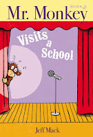
In Mr. Monkey Bakes a Cake, Mr. Monkey indeed does bake a cake. The hard part is getting the cake to the cake show contest as one obstacle after another gets in his way. Book 2, Mr. Monkey Visits a School, follows Mr. Monkey as he learns a cool trick and then heads to the school to present it. But once again, it doesn’t go quite as planned.
 |
| Pictures provided by Jenna Friebel. |
In terms of Geisel criteria, there is a lot that these books get right. The word choices are appropriate for the beginning reader: short words in short sentences. There is a lot of word repetition and easily noticed context clues for the text in the illustrations. Mack uses slapstick humor to keep readers engaged, and Mr. Monkey’s journeys mirror the reader's’ journey towards successfully completing the book.
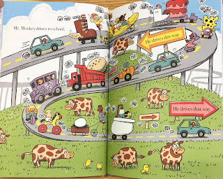
However, under closer scrutiny, I think there are a few missteps. A personal pet peeve of mine is when early readers use a font with a double-story “a.” Kids are taught to write single-story “a” so this makes sight words appear different. While some pages do a great job of a having a simple illustration with plenty of white space and clear text, other pages are overly busy.
A lot of speech bubbles are used which sometimes feel unnecessary, but it fits with the comics-style theme. They are short, sound words (ooh, grr, oops) so it doesn’t distract too much away from the main text. There are instances though with additional text in the illustrations beyond the speech bubbles. Both books feature illustrations showing a computer screen with text on it that is in all caps in a different font than the main text which might be confusing for new readers.
I have no idea if this will play into award consideration at all, but there has been discussion about the use of monkeys in children's literature and how that can be problematic. Edi Campbell has several posts on her blog on the topic. Elisa Gall (who also contributes to Guessing Geisel!) has also shared her thoughts.
It’s very likely that these high-appeal books will be discussed by the real committee come Midwinter, but whether the successful elements outweigh the not-so-successful remains to be seen.


No comments:
Post a Comment
Note: Only a member of this blog may post a comment.