Pages

Wednesday, October 31, 2018

We Are All Me by Jordan Crane

Alec Chunn is a librarian and book reviewer in Eugene, Oregon. He served on the 2018 Rainbow Book List Committee and currently co-runs the mock Stonewall Book Award blog, Medal on My Mind


Book cover of We Are All Me by Jordan Crane
How do you explain metaphysics to a child? Though I’m sure attempts have been made, I’m certain that none are as successful as Jordan Crane’s We Are All Me at distilling down philosophical ideas into a concise 96-word early reader.

The story (or is it a poem?) starts with the self then expands into body, world, air, cloud, water. Earth. Seed. Sunshine. Root. Life grows into leaves and fruits and bugs and bees. But, under it all is bone, meat, a heartbeat. Cells. Atoms. Existence. The message that’s preached: “We are all one.”


Image from Toon-Books.com

I know what you’re thinking. This sounds like a trippy book. It is a trippy book, hands down. But it’s also kind of amazing. And I’ve never seen anything like it in an early reader. Of the 96 words I mentioned, 44 unique words are used. About a third of those are sight words. The book relies on repetition of both words and images to help convey meaning as it shifts into more complex words like “aware” or “exists” or “atom.”

This rhythmic repetition carries the story—and the reader—along. Likewise, the way the pictures build on (and connect to) each other is integral to understanding the book. For instance, the clouds that are introduced on one page (on which the text reads “made of air”) are replicated on the next (“and of cloud”) but then changed to indicate rain (“made of water”). For something about interconnectedness, it’s a very granular presentation. The pictures bring the complexity of the theme into something easier to decode for a K-2nd grade audience.


Image from Toon-Books.com
But would kids even read this pen-and-ink hardcover that looks like it’s straight out of the 1960s? I haven’t actually read this title with kids, so I don’t know. As the Geisel criteria states, “[the] subject matter must be intriguing enough to motivate the child to read.” I believe that the cover is undeniably inviting, from the way “we” and “me” are visual mirrors of each other, to the vibrant, almost psychedelic colors. I think the topic of interconnectedness is something that we all want to explore, regardless of our belief systems. And I think the story is accessible, though it might require some adult mediation.

Sure, it’s an abstract book. It’s an abstract concept, too. But as far as simplified philosophy goes, it doesn’t get much better than this. Though I think the chances that the Geisel committee will choose this one are slim to none, I’m still holding out some hope. I’m a big fan of anything that pushes the limits of the format and I think this title does just that.

Monday, October 29, 2018

A Parade of Elephants by Kevin Henkes

Image courtesy of author
This week’s guest contributor is Kahla Gubanich, a children’s and maker librarian at Carroll County Public Library in Maryland.

Book cover of A Parade of Elephants by Kevin Henkes

Kevin Henkes’ newest picture book, A Parade of Elephants, opens with a bold invitation: “Look! Elephants!” That simple sentence is a solid hook, because honestly, who could not look after that exclamation? In the following pages, a colorful parade of elephants marches around in a circle, up and down hills, over splashing rivers and under lush treetops, in and out of tunnels. They march all day, and when night falls, they yawn and stretch in preparation for bed. But just before they settle, they lift their trunks to the sky and trumpet, filling the night sky with stars.

Image of elephants walking in a circle from A Parade of Elephants by Kevin Henkes

The plot is simple: For the bulk of the book, the elephants are marching. The details lie in how they march. One page describes the round elephants moving in a round circle, while another shows the elephants moving in and out of a tunnel. This simplicity allows very young readers to focus on the basic idea of each page as they decipher the words. The large, bold text stands out cleanly against the white and pastel pink backgrounds. Simple sentences are often composed of only two words (“Over, under”), or include multiple repetitions of a single word (“Big and round and round they are”). The rhythm and repetition even suggest the slow, steady thump of marching elephant feet. The uncluttered illustrations in soothing pastel colors mirror the action portrayed in the text, giving young readers visual support to help them interpret the words.

This story is very much written in the voice of its intended audience, from that opening invitation (“Look! Elephants!”) to the simple two-word descriptions (“Up, Down”) to the multiple repetitions of single words (“They march and they march and they march”). I imagine that if I gave a young child a wordless version of this picture book, their invented story would likely closely resemble the actual text. Even so, there are still opportunities for new vocabulary near the end, when the elephants raise their trunks and trumpet.

Image of elephants trumpeting stars from A Parade of Elephants by Kevin Henkes

The grace of this simple story exists in the minor details of the illustrations: The baby elephant at the back of the parade stretches out a tiny trunk to grab the tail of the larger elephant ahead; the yellow elephant second in line strides forward with extended trunk and tail, full of purpose, while the purple elephant tucked in the middle seems more contemplative. Readers of all ages will delight at the page turn that reveals a row of five elephant back sides, standing still for the first time as they gaze at the moon, and again when five elephants yawn and stretch before bed.

Image of elephants yawning and stretching from A Parade of Elephants by Kevin Henkes

As with so many of Kevin Henkes’ other works that children, parents, and librarians have fallen in love with over the years, A Parade of Elephants is a seemingly simple story that masks its rich complexity and holds up very well to multiple readings. Young readers can build confidence with this book, and at the end of the day, there is nothing quite like an elephant to win over the hearts of readers of all ages.

Friday, October 26, 2018

Ghoulia by Barbara Cantini

Image of Meagan Albright against a colorful flower background
 Today’s guest contributor, Meagan Albright, is a Youth Services Librarian III at the NSU Alvin Sherman Library, Research and Information Technology Center in Fort Lauderdale, FL. She served on a variety of ALSC Committees, including the 2018 Theodor Seuss Geisel Award Selection Committee and the 2012 Notable Children’s Books Committee. Meagan’s current work philosophy is inspired by Doctor Who: “We’re all stories in the end. Just make it a good one.”
Ghoulia welcomes newly independent readers with strong, simple sentences in a large “handwritten” font that introduces the characters and the hook of the book (zombie seeking friendship) on pages with limited text and plenty of white (well… black or orange) space on the page. However, the layout of the text on the pages is potentially confusing for some readers, who may be unsure if the sentence should be read straight across or page-by-page.  
On subsequent pages, readers find a shift in both the font and style, with longer text blocks and more challenging vocabulary. Engaging illustrations and a sufficient use of white space around these text blocks lend a page-turning dynamic that encourages readers and propels them through the story. The problem of confusing text placement, however, recurs throughout the book.
Text "Making Friends can be scary . . . if you're a zombie." crosses a two-page spread against a field of black.
Images provided by Meagan Albright
For example, on this double-page spread, it is tempting for readers to follow the visual cue of leaves across the pages, but the flow of the story clearly works better if readers finish the text on the page first before moving to the second page in the spread.
A two-page spread depicting Ghoulia introducing herself to other kids dressed as a witch, vampire, mummy, and ghost.

Occasionally problematic text placement aside, Ghoulia has many positive qualities. The concepts of diversity, acceptance and friendship are clearly conveyed, and the witty tone keeps these lessons from feeling didactic. The spooky tone and subject matter make the book an obvious choice for Halloween, but the (as Booklist describes it) “charmingly morbid” new series will appeal to readers year-round.
While Ghoulia is without a doubt an engaging, humorous and delightful book, this year’s Geisel committee will have to decide if it rises to the level of distinguished and fully meets the award’s criteria. For readers at the younger end of the award’s spectrum (which is pre-K through Grade 2), Ghoulia may serve best as a shared, rather than independent, reading experience. The book features difficult vocabulary (venture, waltzed, forbade, furious, misfortune) that is not always explicitly explained by the illustrations and these new words are not consistently repeated enough to ensure knowledge retention. Dense blocks of text may prove intimidating, and the charming labels and asides contained in the illustrations result in the occasional unusual text placement on the page.
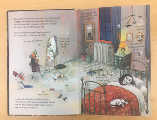
Two-page spread showing Ghoulia's bedroom, with her admiring her relection in the mirror and sleeping in bed.

Though Ghoulia does not make my personal list for the 2019 Theodor Seuss Geisel Award, I know the book will find many young readers who are delighted by this witty, engaging, faux-dark tale.

Wednesday, October 24, 2018

Could a Media Tie-In Ever Win the Geisel?

In any given cart of beginning reader books that I purchase for my library, I've noticed that one-third to one-half of the books that I buy are media tie-ins: books related to some themed property, movie, or TV show. Kids like these books, with their bright, familiar characters, and will ask for them by name. They generally circulate well, at least as long as the show they're based on is popular, and publishers crank them out at a prodigious rate. Everyone is happy. But could one of these books ever win the Geisel?

Take, for instance, Peg + Cat: The Camp Problem (Candlewick, 2018). The Peg + Cat franchise started out as a book series, but quickly made the jump to TV, and this book is based on one of the show's episodes. A closer look reveals two of the problems that media tie-ins face for award consideration: authorship and originality. Authorship of media tie-ins can be tricky to determine: the names on the cover are Jennifer Oxley and Billy Aronson, the original illustrator and author, but a look at the CIP data indicates that the text is by Andrea Cascardi. Moreover, the book is based on a television script by Meryl Schumacher. That actually puts the book out of contention for the Geisel right away, as the criteria states, "There are no limitations as to the character of the book considered except that it will be original…" Is a book based on a TV episode "original?" It's hard to imagine any committee making a case for this.

But what about media tie-ins not based on a movie or TV episode? These are rarer, but they do exist – books about the Shopkins come to mind, and some Barbie titles. The committee would have to make a decision about whether such books qualify as "original" if based on characters from a commercial property – my feeling is that this would be an uphill battle. Even if the text was deemed original, what about the illustrations?

Suppose such a book existed – a media tie-in with original text and illustrations? For the committee to select it as the most distinguished book for beginning readers of the year, it would have to embody the criteria with a high degree of excellence . . . and, to be brutally honest, few media tie-ins do. A quick scan of such titles reveals complicated vocabulary without repetition to reinforce newly acquired words, difficult fonts and text placement, and complex sentence structure. Some are better than others, of course, but few rise above their type. All of them, of course, succeed in one particular area: children are highly motivated to read about their favorite characters, and that can often compensate for shortcomings in the books' writing and design. That's where these books come in handy, of course – in providing reading practice that is appealing to child readers. Media tie-ins are useful books, but could one ever win the Geisel? In my opinion, doubtful.

Monday, October 22, 2018

Kick It, Mo! and Pass the Ball, Mo! by David A. Adler, illustrated by Sam Ricks

Today's post comes from Jackie Partch. Jackie is a School Corps Librarian at Multnomah County Library, where she does outreach to K-12 students. She was a member of the 2012 Geisel committee.


Mo Jackson is back in these two titles, sequels to the 2016 Geisel medal winner Don't Throw It to Mo! and 2017's Get a Hit, Mo! This time Mo is taking on soccer (Kick It, Mo!) and basketball (Pass the Ball, Mo!), and just as in the other books, he's still the smallest kid on his team. Even though he still sometimes struggles with the fundamentals of the sports, he once again manages to pull off wins each time. As in the previous books, the teams include a diverse cast of characters; both the basketball and soccer teams are coed, and the coaches are female.

Let's look at ways these books meet some of the Geisel criteria:
  • Words are repeated in an easily recognizable pattern to ensure knowledge retention: This image from pages 4-5 of Kick It, Mo! is an excellent example of the use of repetition of a key word, and similar sections of patterned text happen throughout the books. And that pillow flying out of view is a great example of another criteria, the "page-turning" dynamic. Kids want to find out what will happen next!
  • The illustrations function as keys or clues to the text: This is almost always the case; for example, in one scene the words cereal and blueberries are introduced, while the picture shows Mo tossing the berries into his bowl, next to the box of cereal on the counter. One exception is the more challenging word president, which is used on the first page of Pass the Ball, Mo! but not supported anywhere in the illustrations.
  • New words are added slowly enough to make learning them a positive experience: Sports terms (such as goalie, pass, or shoot) are introduced gradually and always accompanied by visual support.
  • Book design: The large typeface, uncluttered background, and average line lengths of 4-5 words make these ideal for beginning readers. 
  • The subject matter must be intriguing enough to motivate the child to read: This one is a slam-dunk, since whenever I've introduced the other Mo books to kids, they always want to know if he plays soccer and/or basketball, too.
Both Mo books seem like strong contenders, but my personal favorite is Kick It, Mo! Since they have a similar plot structure, it will be interesting to see whether the Geisel committee considers these books "individually distinct" (one of the definitions of distinguished) enough to win another award.

Friday, October 19, 2018

What Kids Say - October 2018

Welcome to the third What Kids Say post. This series is meant to mimic an important part of Geisel Committee members’ experience: observing while kids read Geisel contenders out loud. You can read more about the inspiration for this series in the inaugural post.

This is how it works. Each month I send a list of four contenders to a half dozen of our guest contributors that are caregivers of or regularly work with K-2nd grade students. I do my best to select a variety of levels and topics for readers at different stages of the learning to read process. Each of the titles highlighted in this post will be covered by guest contributors at some point this year. The focus of this series is on the experiences and observations from kid readers and their grown-up contributors.

A big shout out to Jamie Chowning, DaNae Leu, Samantha Marino, and Stacey Rattner for all their hard work sharing, observing, and collecting feedback from the kids in their lives. This month 61 kids participated nationwide. Most were 2nd graders and they read just one or two titles.


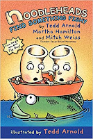
Noodleheads Find
Something Fishy
book cover
Noodleheads Find Something Fishy by Tedd Arnold, Martha Hamilton and Mitch Weiss, illus. by Tedd Arnold
21 kids read the third installment of Noodlehead adventures, which was the longest and most challenging of the books on this month’s list. I wondered if this might deter some readers, but it seems my fears were unfounded. One grown up contributor wrote, “I think the wordplay is at a just-right level--it’s enough of a challenge that they are still thinking about it later, but doesn’t interrupt their reading.”

Most kids found the graphic novel layout easy to follow and nearly all the kids said they enjoyed the book and would read it again. Even a few kids who needed help sounding out 6-10 words enjoyed it and said they would read it a second time. Some words that tripped up readers included, Noodleheads, taught, also, bean. Two readers asked their grown up to bring home more books in the series.

The details in the text and illustrations seemed to have been memorable for many kids: 

  • “I like that the fish tricked the noodleheads that she was the biggest when she was just a normal fish.” 
  • “I like how they learn a lesen [sic] about fishing.” 
  • “We liked how the fish tricked the noodles.” 
  • “Liked the part where they took a map.”

One child particularly loved that both characters are named Mac for macaroni and was excited to realize that the only way to tell them apart was shirt color.

Good Dog book cover
Good Dog by Cori Doerrfeld
It cannot be denied that books with cute animals on the covers generally have kid appeal. But I wondered about this title, would the lack of repetition and placement of the text on the page prevent new readers from having a successful reading experience?

26 kids read this title with several written in comments along the lines of, “I like the hole [sic] thing!!!!!!!” On the other hand, there were several kids who seemed less enthused, giving the book only one or two stars out of five. Since most of the kids were in 2nd grade, it seems not many words challenged them. However, a few struggled with 1-5 words and one reader in particular got hung up on hungry, sad, good, Rufus (a person thanked on the dedication page), and Doerrfeld.

It seems the pictures, especially of the cute dog, were super attractive to many kids. Nearly all the comments were about things that happened in the illustrations, such as: 

  • “I liked that the dog was super silly and funny.” 
  •  “When the dog got the tedy [sic] bear and helped it.” 
  • “I liked the pictures.” 
  • “Because the dog was cute. I like the pictures.” 
  • “Didn’t like the guy that chases the dog away.”

Dog books are abundant this year (or maybe I should say, every year?). Some kids who also read Bark Park for last month’s What Kids Say post seemed initially to prefer that dog-filled book to this one. But in the days following their first read of Good Dog they asked for it multiple times. It would be interesting to present readers with several dog/cute animal contenders at once and see how they react and what they choose to read first.

Nobody's Duck book cover
Nobody’s Duck by Mary Sullivan
24 kids read this crowd-pleaser, with most kids saying they’d read it again and/or read a sequel. Several kids wrote on their feedback sheets that they loved “all the quacking.”

Other kid comments included: 

  • “It was bomb. 
  •  “It’s funny, funniest on earth, the thinking cap is great.” 
  • “I liked when the duck went go-karting.” 
  • “I lrd Ducks are Crase [sic]” (I’m guessing this means: I learned ducks are crazy)

On the other hand, two kid readers pointed out that the duck was a “liar pants” because the duck said they didn’t belong to anyone, but actually the duck belongs to the alligator.

The cover art was especially attractive, and the illustrations overall were observed to be a strength, “My kids lingered over the sky diving and race track” wrote one grown up contributor.

A grown up contributor noted that the “slightly complicated layout makes this a good choice for a kid who CAN read longer and more difficult books but is in the mood to relax rather than a very new reader.” The same contributor noted that her six-year-old missed the punchline, but her seven-year-old got it right away. However, even though the six-year-old didn’t quite get the humor of the ending, they enjoyed doing different voices for the duck and alligator, a great indicator of reading fluency.

Finally, there weren’t many words that tripped up kid readers, but this may have been because the majority of this month’s kid readers are in second grade. Most kids only needed help sounding out a word 1-5 times. Interestingly, the word “whose” was problematic for a couple readers.

Overall, this title seems to have a ton of kid appeal, in a large part due to the brightly colored, cartoonish illustrations. It would be interesting to try this book with newer readers to see how they interact with it.

Fox is Late book cover
Fox is Late by Corey R. Tabor
The humor of this book really shined for the 25 kids who read it. “It was so funny!” wrote one reader.

None of the kids who read this book needed help sounding out any words. This could be because it’s one of the easier books featured this month or because nearly all kids who read this time around were 2nd graders. However, I also think it’s notable that even though kids read it with ease it gained near universal approval from our readers. One grown up contributor wrote, “My impression is that Fox is Late was a big hit.”

The skateboard tricks were also a big hit with kids: 

  • “I liked the flip.” 
  • “He did tricks.” 
  • “He did cool tricks.” 
  • “I liked the part when he did a trick. I did not like when he was late.

Several readers liked the line about arriving just in time for lunch. Other readers liked the animals. Some liked both! 

  • “I like it because it has lunch.” 
  • “I like it because it has animals.” 
  •  “I like that the fox eats and that the book has animals.”

I’d love to see how newer readers feel about this title. Would kindergarten or 1st graders have an equally successful reading experience?

----------------------------------------------------------------------------------------------------------------------------------------------------------------- 
So that’s what kids have to say this month! What are your kids saying about these books? Let us know in the comments. Also, you can use the comments to let us know if there are any titles you’d like us to cover in future installments of What Kids Say.

Monday, October 15, 2018

#WNDB: #OwnVoices

Photo courtesy of Gigi Pagliarulo
This week's contributor is Gigi Pagliarulo, a librarian for the Denver Public Library. Gigi is especially interested in youth services, early literacy, and issues of diversity and multiculturalism within children's literature and programming, has served on the steering committee of Colorado Libraries for Early Literacy, and the CLEL Bell Picture Book Award Selection Committee. 

Hello, dear Geisel Guessers, and welcome to Fall 2018, where the issues of representation, equity, and authenticity are more present and more pressing than ever. I’ve been writing this blog yearly since 2016, exploring and working to evolve with these ideas as our understanding of the need for more diverse representation in literature grows. In prior years I’ve discussed the #WeNeedDiverseBooks and #EverydayDiversity movements, and how they relate to beginning readers. Today I’d like to discuss another crucial step forward in the drive towards equality, the #OwnVoices movement.

In 2015, young adult author Corinne Duyvis created the hashtag #OwnVoices on Twitter to highlight children’s and young adult literature where the main character(s) and creators share the same diverse/marginalized identity, as defined by #WNDB. In addition, portrayals of marginalized experiences are also essential for furthering authenticity and equity.

The need for the movement is twofold: first, stories of marginalized groups by majority-group authors have frequently been, as Kayla Whaley writes for Brightly, “rife with stereotypes, tropes, and harmful portrayals”, and even when they are stereotype-free, can never reach the true “nuance and authority that comes with writing from lived experience.” In addition, authors and illustrators from marginalized communities have been deeply oppressed by persistent institutional bias in the publishing industry, struggling to get their voices heard while their own stories are co-opted, inauthentically portrayed, and turned into damaging stereotypes. Year after year, research has found that the numbers of diverse characters, creators, and members of the publishing industry are inequitable.

While the genre of beginning readers is one known more for Everyday Diversity than specific portrayals of marginalized experiences, and yet the need for a multitude of diverse stories to be told and characters portrayed authentically, free from harmful representations and with appropriate nuance is something that children learning to read need as desperately as the rest of the reading (and pre-reading!) population. It can never be said enough: all people, particularly children and particularly children from marginalized groups, need to see themselves accurately portrayed in books, and creatorship has a vital role to play.

Librarian Amy Forrester, one of the excellent editors of this blog, performed a diversity audit of the early books and transitional readers in her large public library system’s collection. The results are more than sobering, and #OwnVoices author and illustratorship are among the lowest representation out there: “a scant 1% of Early Books authors and illustrators (that's combining them together) are OwnVoices.”

Publishers need to know that we—parents, librarians, teachers, and most importantly, kids, want to read more #OwnVoices stories across all genres. Consider letting some of the major publishers of beginning readers know how you feel! Here are three ways to take action to let publishers know you want more #OwnVoices titles:

  • Going to a library conference? Stop by publisher booths and ask a rep for their favorite upcoming #OwnVoices titles. 
  • If you do any purchasing at your library, contact your vendor and publisher reps and ask specifically for #OwnVoices. 
  • Use social media to cheer on publishers who put out #OwnVoices titles, and let them you know want more.

In the meantime, please seek out some of the few #OwnVoices beginning reader titles that Amy and her team identified.

Tony Dungy and Lauren Dungy Ready-to-Reads, illustrated by Vanessa Brantley Newton


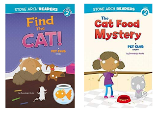
Find the Cat and The Cat Food Mystery by Gwendolyn Hooks, illustrated by Mike Byrne

Moving Day by Anthony C. Brandon, illustrated by Wong Herbert Yee

My Favorite Foods by Dana Meachen Rau, illustrated by Grace Lin

Ready? Set. Raymond! By Vaunda Micheaux Nelson, illustrated by Derek Anderson

Friday, October 12, 2018

Quiet by Tomie dePaola

Quiet by Tomie dePaola, cover image
Two children, out walking with their grandfather, observe how nature is both busy and quiet. In the first half of the book, they see birds flying, a frog jumping, a dog chasing a ball, and more activity surrounding them. When the three sit together on a bench, they observe the birds resting, the frog sitting, the dog sleeping. "To be quiet and still," the book concludes, "is a special thing."

Appropriately, for a book focused on being contemplative and mindful, the vocabulary here is simple, containing lots of sight words. Longer words like 'dragonfly' are ones that should be easy for inexperienced readers to take apart and sound out. Each page contains one or two sentences, and most of those sentences are short. Even the longer ones top out at only eleven or twelve words. And the structure of the book itself means that many words will be repeated, as each creature or natural element is observed first in motion, then at rest. The text is neither as large nor as bold as it would be in a traditional reader, but it's clear and legible. The font is a thin sans-serif, and always appears against the white space that is the sky in dePaola’s distinctive illustrations. Those illustrations support the text well, for the most part, though there are a few words that may take a little more work – for instance, it's hard to represent 'blinking' in a single still image.

In a book as, well, quiet as Quiet, it's hard to typify a 'page-turning dynamic,' but when children recognize the book's repeating structure, they may be interested to see what each of the things from the first half of the book are doing in the second. After all, not every book has to be full of dizzying plot twists. Sometimes, it's enough to just be Quiet

Quiet by Tomie dePaola, final page spread

Wednesday, October 10, 2018

Fergus and Zeke at the Science Fair by Kate Messner, illustrated by Heather Ross

Fergus and Zeke at
the Science Fair book cover
The classroom mice duo from last year's Fergus and Zeke are back for a second round of adventures. This time the kids in the mice's classroom are getting ready for the science fair and Fergus and Zeke want to participate too. But each project the mice try to copy goes humorously wrong. Finally, the pair decide their experiment will be to train the kid using them as an experiment!

Ross's digital illustrations are bright and cheery. Targeting the upper range of the award criteria, the longer chapters (approximately 10 pages each) are broken up with a combination of spot and full-bleed illustrations. As is suitable for this reading level the illustrations provide some context for new words and concepts, especially how each experiment works, but there are fairly large text blocks as well. 

Messner builds repetition into the text quite often. For instance, the word "experiment" is used 5 times in the first chapter alone. There are a few multi syllablic words used only once, which could trip up some readers; words like "announcement" and "masterpieces." But for the most part new words are repeated to allow for lots of practice.
Image of mice listening to a teacher read and doing classwork from Fergus and Zeke at the Science Fair.
This is a school-oriented story with a rather obviously educational bent to it. In fact, nit would have been nice to have back matter with step by step instructions for each of the experiments mentioned in the text. It certainly has plenty of supportive features, but I wonder if it will provide enough page turning appeal for readers. What do you think?
Image of a school science fair from Fergus and Zeke at the Science Fair.

Tuesday, October 9, 2018

Maud the Koala series by J.E. Morris

Cover of Much Too Much Birthday by J.E. Morris
 Cover of Fish Are Not Afraid of Doctors by J.E. MorrisThe new Maud the Koala series by J. E. Morris makes broad use of the sort of graphic novel style panels we’ve seen used so effectively in other beginning readers, with colorful illustrations in a woodcut style. Where the series really excels is in portraying Maud’s experiences in a way that makes her anxieties relatable and accessible to the target audience.

In Much Too Much Birthday, effective use is made of both text and illustration to depict how Maud’s “You can never have too much birthday” attitude is changed as she is squeezed, squashed, jostled, and jabbed. Maud’s pursuit of a little quiet seems entirely natural. There is excellence in the use of the illustrations to contrast the hectic party scene with the calm of the hiding place behind the bushes. Washing out the party scene to allow the reader to focus on the characters referenced in the text is supportive of young readers relying on picture clues to support their decoding. The ending empowers Maud to find her own solutions, both for herself and her friend Simon, which is very respectful of a child reader. 
Interior from Much Too Much Birthday where Maud Koala looks overwhelmed, depicted by a spiral behind her clutching her head. And inset shows her hiding behind a bush.
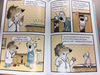
In Fish Are Not Afraid of Doctors, Maud is nervous about her checkup and getting a shot. By pretending to be a fish, she gets through the experience just fine and gets a sticker as a reward. There is plenty of repetition of vocabulary like “vaccinations” and “pretended” throughout, and the illustrations are vibrant and engaging. The use of panels keeps the story moving for a reader. Vaccination is at one point phonetically misspelled as “vax-i-nay-shun”, which may help a more confident reader with a potentially unfamiliar word.
An adult directed Note to Caregivers at the end of each book in the series calls out the techniques depicted in the story which may help children cope with an overwhelming situation, yet for the most part the series avoids feeling like didacticism has outweighed considerations of quality. 

5 panels depicting Maud hiding in the doctor's cabinet to avoid getting a shot, then being discovered by her mother and returning to the table for an explanation of what vaccinations are.

Librarians often hear from parents looking for an updated picture book to prepare their child for experiences like visiting the doctor or dentist. Maud the Koala fills this need, and I wouldn’t hesitate to include it in my recommendations to parents. However, it’s this strength that makes me question whether Maud the Koala is really intended for independent reading. Despite its beginning reader trim size, the font and leading are not as large or spacious as we would expect from text directed at beginning readers. Because of the effective use of panels, there’s quite a bit of text on most two-page spreads, and some lengthier sentences. Overall, intended audience would appear to be a child and caregiver together, right down to the caregiver note at the end of each books. Of the two, I think Much Too Much Birthday is more qualified as a Geisel Contender, but I think the true strengths of Maud the Koala may be best appreciated during shared rather than independent reading. What do you think?