Pages

Wednesday, August 29, 2018

Square by Mac Barnett, illustrated by Jon Klassen

Book cover for Square
Today's guest contributor, Benji Martn, is a librarian and educator from Montgomery, Alabama. He serves as the elementary school librarian at Saint James School, and blogs at Tales of an Elementary School Librarian. You can find him on Twitter at @mrBenjimartin.

Square is the second book in Mac Barnett and Jon Klassen’s Shapes series. I wouldn’t call it a sequel, as it really has nothing to do with Triangle which came before it (see the Guessing Geisel post on Triangle), except that Square, our main character, appears in both books.

This is a picture book well-suited for beginning readers. The sentences are short and to the point, and the the vocabulary isn’t too difficult. There are a few words like “sculpture” and “genius” that might be new for some readers, but these words are added slowly enough to make reading Square a positive learning experience. The few difficult words are also repeated several times throughout the book, which helps with retention. The plot is pretty simple and as far I could tell, the kids I read it to and the kids I’ve had read it independently had no trouble following it.

The illustrations are classic Jon Klassen. The character’s expressions and a lot of the humor are conveyed through the placement of the pupils in the character’s eyes, so the illustrations share the story-telling duties with the text.


Three images from the book all of Square, first in a puddle, then on a rock, finally in the rain.


I feel like kids can really relate to Square as a character. What child hasn’t been asked to do something they’ve never done before, something they have no idea how to do? The paralyzing anxiety that comes with that is real. There’s a really positive message in Square. If we give a new task a shot and work hard, who knows what will happen? It’s better than not trying. Mac Barnett relays this message to us in such a funny, subtle way, it doesn’t feel didactic or preachy at all.

I’ve read Square to several groups of children, and the reception has been great. The kids thought it was funny, and they loved the narrator addressing them directly at the end and asking for their opinion. That has led to some really good discussion about what genius really is and accidental art.

I think this book should definitely be on the Geisel committee’s radar. It’s distinguished in every aspect and the fact that it’s part of a series shouldn’t harm it in any way. Square is new and fresh and stands completely on its own.

Friday, August 24, 2018

Holiday House I Like To Read Titles - Spring 2018

Today's guest blogger is Jamie Holcomb, a children's and adult librarian at the Rodolfo "Corky" Gonzales branch of Denver Public Library. She became interested in beginning readers when she didn't know what books to bring home for her personal children once they started kindergarten. She'll be co-presenting on introducing beginning readers to storytime families at the Colorado Libraries for Early Literacy conference this September.

Holiday House continues launching Fountas & Pinnell leveled readers in its successful I Like to Read series. This spring saw the publication of four titles aimed at kindergartners and first graders.


The very earliest is Jump by David McPhail. A level A reader, it offers strong repetition, with only the sentence related to the subject changing from one page to the next. Concrete picture support allows young readers to gain confidence. Oh, it's a cow! A cow can jump!
The pictures add some silliness and context while still matching the text--the kangaroo jumps with the children in her pocket, the cow jumps over the moon. Finally, it's always nice to see a beginning reader with diverse characters. Where it falls short is plot. The best level A readers build tension with very few words, while this one seems random. Animals follow one another, but there is no climactic moment. A secondary concern is that pronouns are not repeated and are hard to guess from the pictures.


At level C is Pig and Cat Are Pals by Douglas Florian. A pig and cat share many fun experiences together--swimming, reading, making art--but Cat becomes lonely when Pig meets Dog. Soon, though, all three play together. This blog's "What Kids Say" series found that child readers related to the crayon artwork. It's deceptively detailed and rewards kids who look closely and read again and again. The plot, too, is relatable--who hasn't felt lonely when their best friend makes a new friend? My primary concern is the placement of the text. I have watched very young readers struggle to locate words on the page, overlooking entire sentences. The placement is different from one page to the next and the words are located on the illustrations, adding further challenge.


The level D title is Hide! by Steve Henry. A fish escapes from his bowl while his elephant owner naps on a boat. Pat the fish has fun--but soon the fish are menaced by a shark! Not to worry, Mike the elephant comes to help and in turn, the fish help Mike back to the surface. This one will appeal both to kids who want a little scare and those who like slapstick.
The cartoony, full-page illustrations carry a lot of the drama and humor while still being supportive. Words are decodable with some slightly more advanced skills like silent "e," and useful sight words like "now" and "help" get plenty of repetition. It checks a lot of boxes. Repetition, check. Page-turning dynamic, check. I wouldn’t hesitate to recommend it to a late kindergartner or early first grader, and I think a lot of kids will enjoy it. But I simply wouldn't describe it as "distinguished."


The final title is Min Makes a Machine (level E) by Emily Arnold McCully. A young girl elephant creates a siphon device to get water out of an old well so she and her friend can swim on a hot day. Girl power, science skills and the power of persistence will appeal to a both kids and caregivers. The illustrations are a weak point--they get the job done, but they don't invite a closer look or repeated viewing. And while the plot is fine, I don’t imagine kids wanting to go back and read it over because there's just not a lot of narrative tension. Again, it checks boxes, but "distinguished" isn't one of them. 

That's the common theme for the spring offerings. They are competent, welcome additions to the paltry offerings available for very early readers. I think they will help many young children create positive early reading experiences, and I will continue to recommend the series. But none have that extra originality or freshness that sets an award winner apart.

Wednesday, August 22, 2018

Alexander Hamilton: A Plan for America by Sarah Albee, illustrated by Chin Ko

Photo of Danielle
Provided by Danielle Hartsfield
Today's guest blogger, Danielle Hartsfield, is Assistant Professor in the Teacher Education Department at the University of North Georgia. She recently completed her service as a member of the 2018 Robert F. Sibert Medal committee and as co-chair of the Association for Library Service to Children Education Committee. She also serves on the board of the Children’s Literature and Reading Special Interest Group of the International Literacy Association and reviews for School Library Connection.

Cover from Harpercollins.com

Could 2019 be the year that a Geisel nod goes to a biography? Alexander Hamilton: A Plan for America relates the life of one of America’s foremost Founding Fathers. After the opening page spread offers an overview of Hamilton’s many accomplishments (and foreshadows his contentious relationship with Aaron Burr), the chronological narrative highlights Hamilton’s achievements in the American Revolution and as a political figure.

Let’s start with the reasons why the Geisel committee might consider this book. The design is suitable for young readers; the font size is large, and there is ample white space between each line. Most sentences are short, and the occasional lengthy sentences never exceed four lines. The illustrations often support what is occurring in the text, and the soft, rounded, almost cartoon-like paintings will appeal to younger children. (If you were a little kid, would you want to see a picture like this in your book? With no disrespect meant to Mr. Hamilton, I think not!)

However, readers who want to see images from Hamilton’s time can satisfy their curiosity by perusing the book’s back matter. In addition to historical artwork, the back matter includes a timeline of Hamilton’s life; additional information about his views, family, and death; and places where readers can visit to learn more. It does not include a bibliography. This may not be particularly important to its intended audience, but it shortchanges the adult readers (librarians and teachers) who are responsible for providing credible and accurate information to children.

If the Geisel race was a duel, this book has several shortcomings that nearly ensure a fatal shot. The writing is dry; it has none of the humor and punch evident in Sarah Albee’s other titles (take last year’s middle grade Poison, for example). Yes, sentences must be “simple and straightforward” in Geisel contenders, but this need not be synonymous with “boring.” The conclusion (“His genius lives on today”) falls flat; here, Albee misses an opportunity to make Hamilton’s life relevant to the lives of today’s young readers. What contributions did Hamilton make that impacts their world today? We never find out. Additionally, the transitions between the events in Hamilton’s life are sometimes abrupt, which could potentially confuse readers.

In some ways, the book is not appropriate for its intended audience. It assumes readers have background knowledge of the American Revolution. For example, “colonists” is never defined in the text, and readers must rely on what they already know to understand this part of Hamilton’s story. While introducing beginning readers to vocabulary like “debt” and “treasury” is not a bad thing, it is problematic without the support of in-text definitions or a glossary, which are both lacking. Given the complexities associated with the content and vocabulary, this book most suitable for third graders who are receiving adult support, which puts it beyond the award’s age range.

If a biography does win a Geisel next year, I predict this book won’t be the one sporting a gold or silver sticker.

Monday, August 20, 2018

Walk Your Dog by Elizabeth Stevens Omlor, illustrated by Neesha Hudson

Book cover of Walk Your Dog
From the moment they wake up in the morning until they drift off to sleep at night a girl and her dog are inseparable. (Note the flap copy and summary describe the protagonist as a girl, and I will use she/her pronouns in this post, however the main text does not specify the character’s gender identity.) Using three word, declarative sentences readers narrate the duo’s day from breakfast and getting dressed, through a messy, but satisfying walk in the park, to an evening of stories and snuggles.

Omlor’s brief, but engaging text uses a repetitive sentence structure and a large, easy to read font. Each sentence is smartly placed on the page with ample white space. Hudson’s bright and cheerful watercolor and colored pencil illustrations alternate between full-bleed two page spreads and sequential images that show action, while also adding humorous touches. The movement and humor create that sought after “page-turning dynamic” mentioned in the award criteria.

Image of girl dressing her dog in many outfits. Text reads: Dress your dog. 
From Walk Your Dog by Elizabeth Stevens Omlor, illustrated by Neescha Hudson.

This brings us to word and sentence repetition. While there is indeed quite a lot of repetition in the text, the repetition is reserved for the same two words throughout the book.

       “Greet your dog.
       Groom your dog.
       Feed your dog.
       Dress your dog.
       Walk your dog.”

While some of these action words are sight words, and therefore recognizable to some new readers, it’s still unfortunate that none of them are ever repeated to give readers the opportunity to gain confidence and mastery with them.

Another element to consider is the word choice in combination with the visual context clues. This is slightly different than assessing word choice in picture books for reading aloud, in fact we actively look for read aloud titles that expand vocabulary. However, word choice looks different when looked at through a beginning reader lens. It’s not that the illustrations don’t provide clues to the words, they do. Instead, it’s a case of wondering, using visual context clues will readers arrive at the same word selected by the author? Here are a couple of examples.

This first one reads, “Groom your dog.” But I wonder, would “Brush your dog” have been a stronger choice?

Image of girl brushing dog in bathroom. Text reads: Groom your dog. 
From Walk Your Dog by Elizabeth Stevens Omlor, illustrated by Neescha Hudson.

Here’s another. Would readers use the illustrations to suss out “Settle your dog.” or would they be more likely to think, “Read to your dog.” ?
Image on right of girl reading to her dog. On left, the dog following girl. Text reads: Settle your dog. 
From Walk Your Dog by Elizabeth Stevens Omlor, illustrated by Neescha Hudson.

Overall, I think there’s a lot to admire in this charming picture book. The subject matter is engaging (I was just asked for beginning readers with dogs the other day) and the page-turning dynamic is enviable. But my hopes of it being a good fit for very new readers, based on sentence length and font size, weren’t as satisfied. That said, I haven’t observed any kids reading it. If you have, how did it go? Leave a comment below.

Friday, August 17, 2018

Vernon is on his Way: Small Stories by Philip C. Stead

Headshot of Stacey Rattner.
Courtesy of author. 
Stacey Rattner is our guest blogger today. Stacey is the librarian at Castleton Elementary School in upstate New York. She has been running a Mock Geisel project with first graders for the past three years. Stacey also runs a Mock Caldecott and Newbery and Sibert Smackdown. One of the highlights of her year is when she watches the ALA Youth Media Awards live in the auditorium with all her students. You can find Stacey on Twitter @staceybethr @C_ESLibrary or blogging at http://librarianleaps.blogspot.com. 


Book Cover of Vernon is on His Way
by Philip C. Stead

Last month I was leading a workshop on new books. One elementary librarian’s response after reading Vernon is on His Way: Small Stories by Philip C. Stead was “It’s very Philip Stead.” I would go a bit deeper and call it Philip Stead meets Arnold Lobel. 

Three friends, Vernon, Porcupine and Skunk, are the stars of this beautifully illustrated picture book divided into three chapters. In the first chapter, wide eyed Vernon the frog is waiting and waiting for his pal the snail to wake up. Minimal illustrations amid much white space help to create a situation that the reader can easily relate to Vernon’s impatience. When his friend finally wakes up, “Vernon is on his way.” 

The book wakes up in the second and third chapters. In “Fishing” Vernon, Skunk and Porcupine set out to go fishing. Porcupine, who does not know how to fish, is anxious about the upcoming adventure and, as a result, is not able to eat or sleep.With a single bobber in the water, the fishing experience is more about the three friends conversing and bonding. Nerves subsided, it is Porcupine who asks while looking out into the purple hued sky, “Can we go fishing tomorrow?” 

Illustration of Skunk, Vernon, and Porcupine sitting in the forest from Vernon is on His Way by Philip C. Stead.  

In the third chapter, Bird has not been around for a very long time and Vernon’s memories of him are fading. “So Vernon went out to look for his memories” by the river, in the forest, and in the clouds. This worries Porcupine and Skunk and they set out on their own to find things to cheer him up. 

As lovely and heartwarming as this book is, I don’t believe it is a contender for the Geisel award. The first chapter starts off strong in the running, with repetitive text, short sentences and context clues. It is simple and easy to comprehend. However, the subsequent chapters are more complex. In fact, I’ve observed adults question the plot. Random ideas are not supported by the illustrations which may confuse emerging readers. “Do fish have toes?” “If I were a fish, I would not like to be wet all the time.” Even if those sentences make them giggle, readers may still not see how it all fits within with the story. 

In addition, there are some words that early readers will be challenged to read and define such as ruining, foraging, and rummaged. In these cases the illustrations don’t assist the reader in pronouncing the word or providing clues to its definition. 

Fans of Lobel’s Frog and Toad (and who isn’t?) will definitely want to pick up a copy of Vernon. My prediction? Young readers will request Vernon to be read aloud over and over again. Then once confident with the story, it will become a favorite independent book. Children will enjoy and relate to the quirky characters and situations. Discovering surprises with each new reading will bring a sunlit smile to their face as they read one of their very first chapter books. Not a Geisel winner but a winner nonetheless.

Illustration of Skunk, Vernon, and Porcupine waving as the sun sets and a fish jumps in the water
 from Vernon is on His Way by Philip C. Stead.

Wednesday, August 15, 2018

#WNDB: Disability Representation

Danielle Jones is a youth and teen librarian in Portland, Oregon. She has served on the 2018 Sibert Committee and the 2016 ALSC Notable Children’s Books Committee.

The Geisel Award’s stated purpose is to honor books that “through their literary and artistic achievements, demonstrate creativity and imagination to engage children in reading.” All children deserve to be a part of this audience that we are trying to engage, and readers are more likely to be engaged in a book where they see themselves represented.

The Condition of Education 2016 report from the National Center for Education Statistics (NCES) shows that in 2013–14, there were 6.5 million students (13% of students) receiving special education services. Among students receiving special education services, 35 percent had specific learning disabilities. By fourth grade, on average, children with disabilities are reading below grade level. Representation in books should be considered a factor. Having books that serve as mirrors would not only have personal importance, but by engaging the reader, such books could lead to greater reading success. With their controlled vocabulary, beginning reading books are tools that are often used with struggling readers, readers reading below grade level, and students with learning disabilities.

So where are the beginning reading books with characters with disabilities?

I have yet to find a reader that features a main character with a disability. There are some books that show a character in a group shot or in the background in a wheelchair, but none show a prominent character with a disability.

Emerging readers are often drawn to series, as they find their formulas comforting in their predictability as they build their reading skills. Series often feature two buddies that can have multiple adventures, lending themselves to a series format. It must be assumed that book creators must consider that characters with a disabilities won’t fit that formula. It is beyond time for this kind of thinking to be disrupted.

Part of the Geisel criteria is that “subject matter must be intriguing enough to motivate the child to read.” Children at this age and developmental stage are building awareness of their world and communities. Inclusive and respectful representation showing all kinds of experiences creates better understanding of others. Children will respond to these. We need books showing children living full and rich lives, and not just books featuring able bodied, neurotypical, and/or typically developing children. We need books that serve as both mirrors and windows. 

In their paper, Respectful Representations of Disability in Picture Books, authors Ashley E. Pennell, Barbara Wollak, and David A. Koppenhaver encourage teachers to use Tar Heel Reader to write books with characters that represent their students. This is a great solution to get books that have representation into classrooms, something that mainstream publishing has failed to do. But as these books are only e-books, they are not eligible to be considered for the award. 

The Geisel Award should be for all children, but a book has to be published for it to have a chance. Many children have yet to see themselves represented in this format. This has to change.

Monday, August 13, 2018

The Itchy Book by LeUyen Pham


The newest Elephant & Piggie Like Reading title might give you "all the feels" . . . itchy ones, that is!  A young dinosaur is dismayed to discover a sign that declares "Dinosaurs Do Not Scratch" -- a statement that quickly becomes problematic, as each of his friends that happens along has some sort of itch that demands scratching. The first dinosaur encourages all of them to be "tough dinosaurs" and resist scratching, and even invites them to bombard it with itchy things.  When a strategically placed turtle moves and it's revealed that the sign actually reads "Dinosaurs Do Not Scratch Alone," a scratching frenzy ensues.

Young readers will likely enjoy the humor that is present, both in the text and the illustrations. For instance, the pterodactyl is obviously defensive of its dinosaur status: "Who said I was not a dinosaur? Some BIRD?!" In a funny scene a few pages later, when T-Rex appears, he asks for help scratching behind a shirt tag that he obviously can't reach with his small arms. "You tell him," one dinosaur says to the others.


Due to the popularity of the series, this book is sure to enjoy a wide readership -- but is it a candidate for the Geisel? It's obvious that this book is aimed toward more confident readers, not raw beginners.  The vocabulary and syntax are slightly more challenging than the original Elephant & Piggie series, though on par with many other Elephant & Piggie Like Reading books. The most challenging aspect of the book, however, may be the layout.  Some of these pages have a lot going on, and it's easy to miss a speech bubble or some of the hand-lettered text embedded in the illustrations. The hand-lettering makes for a variety of font styles, from the carved-out letters on the stone sign, to the emphatic pen-scratched capitals. Some readers may skip over all of these, and most are inessential (the sign is essential, but it's repeated in the printed dialogue), but the word "Itchy" in the illustration above is necessary to the story, and it's surrounded by a particularly busy batch of images.  Plus, if you look at the illustration below, some of that hand-lettered text might be difficult to parse: "Ungh..." "Oyp!!!"

On one hand, this is good training in how to read comics . . . but how will young readers react?  Will the busy layout hamper the reading experience, or are readers with a little bit of experience under their belts itching for this sort of challenge?

Also, why don't dinosaurs scratch alone?  The question is asked, but never answered. It's not a very satisfying payoff for such a big build-up. All in all, this title's Geisel chances are slim, but who knows? For this year's committee, it might just scratch an itch.


Friday, August 10, 2018

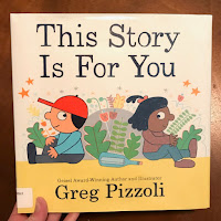
This Story is For You by Greg Pizzoli

Picture of Elisa Gall
Today's contributor is Elisa Gall, is a librarian and educator from the Chicagoland area. She serves as the Youth Collection Development Librarian at Deerfield (Illinois) Public Library, and she is on the blogging team at Reading While White (http://readingwhilewhite.blogspot.com). You can find her on Twitter at @gallbrary.
Image of book cover, all photos provided by Elisa Gall


 Greg Pizzoli is no stranger to the Geisel Award. He’s already been awarded one for The Watermelon Seed (2014) and an honor for Good Night Owl (2017). With the creation of additional popular and kid-friendly picture books including Templeton Gets His Wish and Number One Sam, it seems Pizzoli has mastered the art of picture books that also function as engaging and successful beginning readers. Therefore, it should come as no surprise that people will be excited to explore his new release, This Story Is For You, with an early reader lens.

Photo of lighthouse endpapers from
@kidlitbookbits
Right from the start, the cover image builds tension, with two children peeking towards each other as their bodies face apart, a message in a bottle between them. The intrigue continues in the front endpapers, where a burst of yellow light from a lighthouse crescendos through the night sky and across the spread, inviting readers to turn the page.

 
Image of ponytailed character
hopping off of a boat onto land
The text is a story-poem of affirmation and love from one friend to another, told in the first-person from the perspective of a White character wearing a baseball hat to a Black character with a ponytail. (Gender is not explicitly named in the story.) The children are shown drawing, exploring on stage (as if performing a play), and then in a full-on fantasy/metaphor inspired by their doodles, in which they are separated and later, through their connection and communication, brought back together. A friendly dog watches and participates on the side, adding another element of visual narrative.

Lettering (done by the author but resembling a classic computer typeface) is clean and crisp, with lots of open space around each word for eyes to rest. The sentences are short and rhythmic: “This story is for you. You and only you. You’re the only one in the world with your eyes...your nose, your fingers, and your smile.” Pizzoli employs repetition as well as words that are sure to be familiar to young readers (such as the parts of the body). The illustrations reflect the text, assisting readers with meaning-making while also adding touches of fun (as seen when the text “your fingers” is accompanied by an image of characters holding up their hands and the dog holding up its paws). Colors radiate off of each page, in hues that are bold, warm, and inviting. The cozy, tender tone is reminiscent of messages from the life and work of Fred Rogers, yet stemming from a central child character.

Image of characters holding up
their fingers and paws on stage


The levels of metaphor and fantasy found within the connected text and images will motivate many re-reads and conversations between readers. With a square-shaped trim size, the book rests size-wize in that space between a traditional picture book and an old-school early reader. That gives the physical book an extra level of grab-ability and interest.

Image of characters hugging
There are some contractions included in the text, including it’s, I’m, you’ll, and you’re, which might create challenges for some readers. The plot itself is a tad ambiguous, so there is potentially a question as to whether it has the same hook for kids as it does for grown-ups. For me, this just depends on the reader and the day, so it’s not a big concern, just something that might pop up in further deliberations regarding this book and the award criteria.  


Unfortunately I haven’t had a chance to share this one with young readers. Have you? I’d love to learn more about how they’ve reacted to this title in the comments.

Wednesday, August 8, 2018

A Mammal is an Animal by Lizzy Rockwell

Cover of A Mammal is an Animal, from Holiday House
A Mammal is an Animal is an informational picture book that highlights the differentiating characteristics of mammals, from bones to live birth and lactation (culminating in a family scene with Mom breastfeeding). That it mostly does so with accessible vocabulary choices and simple sentences is an impressive feat. A Mammal is an Animal builds on its thesis (what defines a mammal) in ways that are age appropriate for young scientists beginning to read. 

The primary text in A Mammal is an Animal is in a larger size, with a stylish serif font and  closely spaced lines. Spreads have 1-5 lines of text. Between vocabulary and presentation, this title would be a better choice for a more confident beginning reader. Secondary text is included on most pages to identify animals pictured in the illustrations and to highlight qualities relevant to the primary text. There are three pages of back matter, which include more difficult vocabulary and a tree of life diagram.

The illustrations portray animal examples of the qualities described in the text, and a racially ambiguous* family of four as a framing mechanism. On repeated readthroughs there are new details to notice in the illustrations, particularly the initial two-page spread of the woodland scene. Only in a few instances does the illustrate clearly provide help decoding vocabulary in the text, another indication that this is text for a more fluent beginning reader. "Vertebrae" stands out as particularly challenging vocabulary in text that otherwise does an excellent job breaking biology concepts into easily decoded terms and sentences of varying lengths.

I will be very interested to see what young readers make of the conceit that the text is a conversation between the children pictured on the first page. I confess that it took me several readthroughs before I understood that to be the reason for the conversational interjections in the text (for example "Okay, then" and "Okay, I've got it!") 

I would not hesitate to hand A Mammal is an Animal to a young reader with an interest in animal science. Overall, the illustrations are compelling and the information is simplified without being reductive to the point of inaccuracy. It can be challenging to find informational text for beginning readers, and A Mammal is an Animal accomplishes the task with an appropriate amount of text and accessible vocabulary.

*Kirkus reviews identifies the family as being multiracial, with "a white dad and a brown-skinned mom". 


Monday, August 6, 2018

Horse & Buggy: Dance, Dance, Dance! by Ethan Long

Today's guest contributor, Anna Taylor, is the Assistant Head of Children’s Services and Collection Development Coordinator for Darien Library in CT. She's a co-convener of ALSC's Children's Collection Management Discussion Group and serves on YALSA’s Quick Picks for Reluctant Young Adult Readers. Find her on Instagram @librarianna 


 “Horse loves to dance!
Buggy does not.
Or does she?”

Ethan Long’s new set of characters include a horse named Horse and a fly named Buggy. (However, the only mention of the fly being named Buggy is on the back of the book and as part of the title).

Horse is dancing! Horse shows off their many dance moves through comic-like panel spreads with bright backgrounds of yellow, aqua, orange, lime, and pink. A fly (or as we assume, Buggy) asks horse what they are doing and is confused when Horse says dancing. “I do not hear any music”, says Buggy. Readers are encouraged to imagine the music through Horse’s line “The music is in my mind” as well as the various dance moves, art panels, and dotted lines representing movement on each page. For instance, Horse is assumed to be dancing to the song “Singing in the Rain” on a spread with Horse kicking his leg with a cane in their hand while on an aqua spread with a raindrop pattern.


After showing off numerous dance moves, each with a different style, panel, and background, Horse asks Buggy to dance. Buggy says they can dance but is always making an excuse, “I just ate.” It isn’t until Horse brings in a boombox that Buggy happily dances…just in time for Horse to lie down and rest from all that dancing.

Ethan Long uses back and forth dialogue to repeat words:
“What are you doing?”
“I am dancing”
“I am the best dancer.”
“I have the best dances.”

Long also throws in some rhythm towards the end of the book to go with the rhythm of the music:
“So turn off that frown.

Start getting down!”

With the use of panels and speech bubbles, readers are introduced to the beginnings of comic books. The reader must look at both the text and the illustrations in order to fully experience the story. Long uses the entire book, including the end pages, to tell the story. The beginning of the book shows Horse dancing with Buggy buzzing around looking confused. The back end pages are an exact replica of what Horse did in the front with Buggy now joining in on the dancing.

Holiday House has leveled this book “Guided Reading Level G” which they put in the beginning of the Grades 1-2 category. This title is part of their “I Like to Read” books and offer supplemental resources to their books online. Holiday House has written that this book “Has been tested by an educational expert and determine to be a guided reading level E.”

It is unknown if there are plans to incorporate additional titles with Hose & Buggy although it is implied with the title formatting. Give this title to readers who want to start stepping into graphic novels. As for the Geisel Committee, I wouldn’t be surprised to see this title on the table but do think it serves a better purpose for the introduction of graphic novels than emerging readers.

Friday, August 3, 2018

Louise Loves Bake Sales by Kelly Light

Today's guest blogger is Katya Schapiro, Senior Children's Librarian at the Bay Ridge Branch of the Brooklyn Public Library. She served on the 2016 Geisel Award committee.

Louise Loves Bake Sales, by Kelly Light, is one of several Louise books from Light, the first of which is the sibling heart-warmer Louise Loves Art. In this I Can Read Book®, Louise and her little brother Art expand the definition of art to include baked goods. Louise plans an ambitious rainbow of cupcakes for a bake sale, but detours into a more conceptual direction after an icing mishap. This is a fun story about siblings and cupcakes, but for some reason I've been resisting reviewing it for the Geisel. Despite a closely controlled word count and sentence structure (it's designated Level 1: Beginning Reading by the publisher), something about the story flow and text/illustration relationship seems daunting, and possibly a little confusing for a new reader.

The heart of the issue is that the story hinges on the fairly complex concept of multiple modes of art, and the illustrations don't offer enough support for the themes. For instance, a sequence where different colors are mixed into icing is confusing in its order and on the page. Some concepts, like 'food can be art' are just difficult to convey in this format.

This concern doesn't negate the charm of the book, which would be a great read or read-aloud and has a funny and generously creative theme. It does, however, make it less likely to be considered for a Geisel Award. Everyone loves cupcakes, though, so who knows?

Wednesday, August 1, 2018

Please, No More Nuts! by Jonathan Fenske

Photos provided by Brian E. Wilson
 Brian E. Wilson works as a Children’s Librarian at the Evanston Public Librarian where he buys a lot of the kids books and has been known to imitate squirrels in story times. He has served on the 2015 Odyssey Committee and the 2017 Caldecott Committee.
The wildly expressive squirrels from the rollicking counting book We Need More Nuts! return in this playful sequel that actually surpasses the first installment. In this broadly comical account (which works as a stand alone title), these critters have had their fill of nuts and beg the reader throughout to take them off their paws. The title emerges as a clever case of persuasive writing, but one that contradicts itself with humorous results. In rhyming text, the squirrels initially try to convince young readers to accept their nutty gift, but then end up listing the increasingly absurd reasons why they no longer enjoy what they once considered a tasty treat. Throughout writer/illustrator Jonathan Fenske (who received a 2016 Geisel Honor for the wonderful A Pig, a Fox, and a Box) uses his gift for comic timing to maintain interest and prompt giggles.

The Geisel criteria states that the illustrations must function as keys or clues to the text. And this is this book's most promising achievement as a Geisel contender. Fenske does a masterful job capturing the characters' body language, as well as their often grotesque grins and grimaces (they would feel at home on an episode of The Ren & Stimpy Show). Each drawing reflects and comments on the absurd mood of the accompanying words. For example, Fenske matches the sentence "Back then I was a nut for nuts" with a drawing of a squirrel with nuts for pupils smiling dreamily. Then he writes "But NOW I cannot stand their guts" and shows the same character holding their nose at the unwanted nut in their extended paw. Look at how he shows the characters' droopy-eyed boredom as they eat nuts for breakfast, brunch, as a snack, lunch, and supper EVERY DAY. In a brilliant touch, later Fenske repeats this passage but this time the characters attempt to convince readers that having nuts during every meal is a good thing. He uses exclamation points ("Nuts for breakfast! Nuts for brunch!") and the illustrations show once-boring meals now shining with triumphant radiance.
The Geisel criteria also mentions that contenders should have a "page-turning dynamic." Although Please, No More Nuts! does not have a narrative per se (it is more like a comedy sketch), the book definitely moves at a rapid pace and propels the reader from one silly scenario to the next. And it all zooms to a satisfying climax with nuts pouring out of the characters' storage closet, followed by a page with the squirrels begging the reader to not close the book which of course makes the readers laugh as they do just that.
Other aspects of the book are strong. The layout is clear; the bold font easy to read. The rhymes are witty ("Here are four nuts./Please take more nuts!"). Fenske's language zips and zings while remaining simple enough for the intended audience. The illustrations (especially the gross-out ones) deftly reflect the giddy goofiness of the text. Overall, a nutty romp that the Geisel committee should not resist.