Today's post comes to us from Katya Schapiro, Senior Children's Librarian at the Bay Ridge Branch of the Brooklyn Public Library. She served on the 2016 Geisel Award committee, and is on the Quicklists Consulting Committee.
As the new school year looms and summer assignments take on a final urgency, we public librarians spend a lot of time assisting frantic parents and children waving summer reading booklists and demanding a pile of level N or H books. Every year, as I guide busy and frustrated people through our alphabetical cataloging system, gently pointing out that their (often misspelled, out of print) lists are meant as suggestions, not rigid requirements, I re-examine my stance on beginning reader cataloging. Aren’t we trying to be helpful to schools? Shouldn’t we just make a few piles or baskets that the inevitable latecomers can grab from without more stress? Who am I helping by being a stickler for reader’s choice when people, many of whom are English language learners, are just trying to get by and do things the right way?
And then I hear it, over and over:
‘I need a book in my level.’
‘Where are the books for kindergartners?’
‘I’m a level B/N/Q…’
I don’t want to confuse young learners and their parents. I don’t want to contradict hard working teachers. But…
I will never stop telling kids that they are a person, not a level. A person with individual interests, talents, and reading needs. My first question when asked for grade level books is invariably ‘who’s the 4th grader?’ I refuse to see reading as a skill that can be attained without reference to content. I used to wonder if this attitude of mine was elitist. Was I devaluing tools that truly help struggling readers and families, just to prioritize my agenda? I still go back and forth with this, and there are times when I just do a search and hand over the books, without commentary, but ultimately, I’ve come to the conclusion that my responsibilities as a public children’s librarian require me to go beyond leveled reading. One of the first things I tell young school groups is that the library exists for them to pursue their interests, not just the school curriculum, and that we offer room for choice. Even the youngest and newest readers deserve the chance to create their own reading environment.
Guided reading, used in moderation, is a helpful teaching shorthand. When understood in context, it helps students to find books that they can grow on and feel confident with. My job, among others, is to help put this tool back into context, as tool, not goal. In the excellent SLJ article shared here last week, Kiera Parrott does a great job breaking down some of the issues with the ways leveled reading is used in the classroom and how those issues interact with the work of librarians. She echoes many professional discussions that I’ve participated in, where it is frequently mentioned that “Fountas and Pinnell advise against making reading levels known to individual students: 'We level books, not children.'” Since that ship has obviously sailed, how do we handle these shelf-level interactions?
First off, I’m working on decreasing the negative. Instead of ‘we don’t organize our books that way,’ I’m trying out ‘I’m sure we have lots of great books that will work for you.’ I share resources like the Scholastic Book Wizard with families so that they can make sure that the books they choose will work for their assignment. Parrott quotes a parent from Darien, CT about the helpfulness of the leveled reading structure, but then that parent follows up with the statement that “[her kids] both read a huge variety of non-leveled books outside of school.”” Good for that parent’s kids, but sometimes the books I’m putting into kids’s hands are the only ones they’ll read, and I want to make sure that they get what they need. With that in mind, I try to offer as much as possible in a single interaction, while using language that helps the child and parent think about their search strategies. After I’ve made readers and their families comfortable, I can use my excitement about literature and my interest in their choices to model a wider notion of reading goals without giving a tedious lecture. On the advice of a very smart colleague, I always offer a few books at level, alongside one or two below and one or two above. Once they get the books home, it’s up to them.
What does this have to do with the Geisel? As I said above, reading habits are established in the beginning, and even the the earliest readers deserve to have a broad and engaging choice in the books they read, and an understanding that their newfound skills are acquired with a larger goal than advancing to the next level. The Geisel criteria, with its focus on quality and an enjoyable reading experience, has given me the language to speak to parents and children about the qualities that they might seek in a book, and the varied and usually hilarious Geisel winners have provided a wide palette of choices to offer readers.
Wanting all children, even struggling readers, to find opportunities for connection, confidence, and giggles in the books they read is the opposite of elitist. It is a gift of trust, and a complimentary way to approach school efforts. After all, we all have the same goal. We want to raise readers who take joy in reading and gain knowledge.
I spoke to Jill Frutkin, a friend and former special education teacher, about this piece, and her response was: “Honestly, I think everyone should be in special education—as in, education should be personalized.” As someone who has often looked at the resources of special education classrooms and wished that they could be available to all students, I couldn’t agree more. We’re never going to get teaching and learning perfectly right. But, as librarians, it’s our job to make it as personal and as exciting as we can for each individual patron.

Tuesday, September 5, 2017

Friday, September 1, 2017
Triangle by Mac Barnett and Jon Klassen

Today's post is written by Liesel Schmidt, a children’s librarian at Denver Public Library’s Central Library. She enjoys exploring the wonders of the world alongside kids of all kinds.

From the cover of the book, a triangle with skinny rectangular legs, stares outward, wide-eyed. There are no words on the cover. The title page helpfully explains that this book is called Triangle by Mac Barnett and Jon Klassen. With trademark deadpan humor, the team behind Sam and Dave Dig a Hole and Extra Yarn tell the tale of a sly shape called Triangle.
Triangle lives in a triangular house, with a triangular space for a door. He decides to leave his home among the outcroppings of triangles, venture past the shapes with no names, and travel to Square’s home among the squares with the purpose of playing a trick. When he arrives, he stands outside Square’s square-shaped door and hisses. Square thinks it is snakes and is afraid. For one wordless spread, Square eyes Triangle with silent fury. Then, Square pursues Triangle back through the squares, the nameless shapes and the triangles to Triangle’s home where suddenly Square becomes lodged in Triangle’s triangular door.
This is one suave Geisel contender. From the matte cover to the rounded corners to the triangular text block on the copyright page, this book is a pleasure to hold and to read. Like Barnett and Klassen’s other works, Triangle is marked by a sort of savvy simplicity. With minimalist illustrations that make sophisticated use of white space and text that conveys as much by what it leaves out as what it includes, this is a book that asks readers form their own opinions.
The story is told in straightforward sentences, printed in clear 18 point font in a consistent location on the page. Clever design choices guide the reader’s interpretation of the text and the plot. The words match Triangle’s journey as he marches from left to right from page to page to Square’s house, then right to left as he retreats. Key words are repeated throughout the text, allowing the reader to develop familiarity with the vocabulary.
Triangle’s spartan narrative technique gives the reader many openings for interpretation. Will beginning readers thrill to those possibilities? Or will the narrative understanding required to interpret the book prove too much of a distraction to a new reader?
It’s a spare, stylish read that challenges and supports readers in equal measure.
Wednesday, August 30, 2017
Stinky Spike books by Paul & Peter Meisel
Our guest blogger today is Susan Kusel, a librarian, children's book buyer and selector at an independent bookstore, and the owner of a children's book consulting company. She has served on the Maryland Blue Crab Young Reader Award committee, the Cybils Easy Readers and Early Chapter Book Awards committee, the 2015 Caldecott Medal selection committee, and she is currently chair of the Sydney Taylor Book Award committee. She blogs at Wizards Wireless.
Stinky Spike the Pirate Dog and Stinky Spike and the Royal Rescue are fun additions to the world of beginning readers. By father and son team Paul and Peter Meisel, the books follow the story of a stinky dog named Spike who gets taken in by a group of silly pirates. Spike’s best gift is his nose, which he uses to help the pirates in the first book, and the Princess Petunia in the sequel.
The books are very appealing to kids: Garbage! Dogs! Pirates! Stinky cheese! I would certainly recommend them as library purchases.
The question is, for the purposes of this blog, would I recommend them to the Geisel committee?
That is trickier to answer.
The subject matter is definitely intriguing. The beginning reader I read it with couldn't wait to find out what happened next. The plot kept moving forward and the story developed. The illustrations are clear and reflect what is happening in the story. They also provide visual clues to the text.
All of that meets the Geisel criteria. So, why am I hesitating?
It’s because of the words.
Although these are obviously books for more advanced readers, they fit the Geisel page requirements. The font size and spacing indicate they are books for children learning to read.
Clearly, the words are going to be harder in these books (they are what most publishers would probably categorize as a Level 3 book) than in something more basic like Elephant and Piggie.
Yet, given that, the words are still too hard. Uncommon words such as: pricklefish, methinks, blimey, blundering, etc. are real challenges to kids at this reading level. The sentences are difficult and unclear. A lot of the challenging words are only used once, without repetition to help the reader learn the words.
All of this adds to the charm and flavor of the books, and makes them work for many other reasons, just not in the Geisel context.
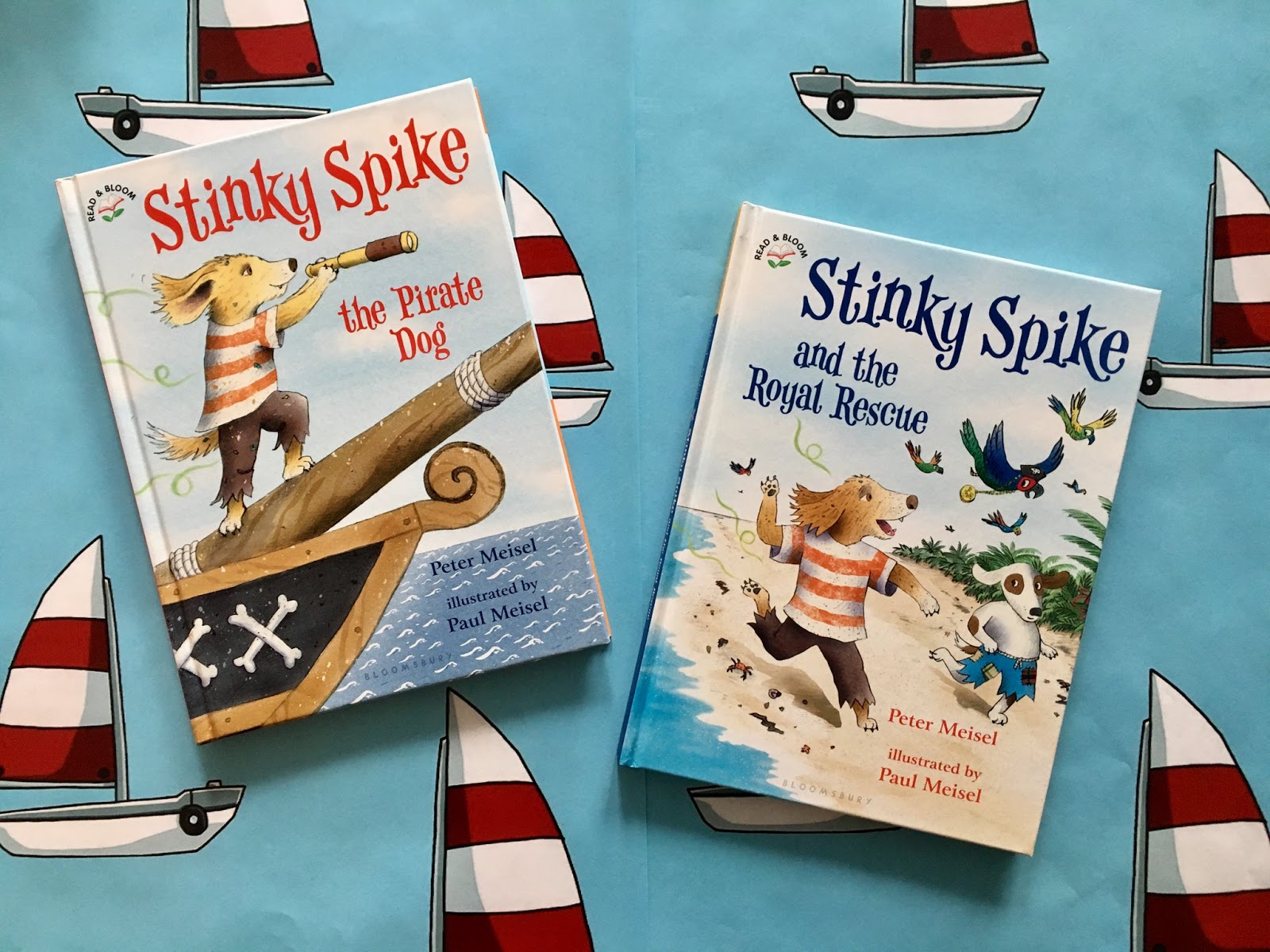 |
| Image from Bloomsbury US Kids |
The books are very appealing to kids: Garbage! Dogs! Pirates! Stinky cheese! I would certainly recommend them as library purchases.
The question is, for the purposes of this blog, would I recommend them to the Geisel committee?
That is trickier to answer.
The subject matter is definitely intriguing. The beginning reader I read it with couldn't wait to find out what happened next. The plot kept moving forward and the story developed. The illustrations are clear and reflect what is happening in the story. They also provide visual clues to the text.
All of that meets the Geisel criteria. So, why am I hesitating?
It’s because of the words.
Although these are obviously books for more advanced readers, they fit the Geisel page requirements. The font size and spacing indicate they are books for children learning to read.
Clearly, the words are going to be harder in these books (they are what most publishers would probably categorize as a Level 3 book) than in something more basic like Elephant and Piggie.
Yet, given that, the words are still too hard. Uncommon words such as: pricklefish, methinks, blimey, blundering, etc. are real challenges to kids at this reading level. The sentences are difficult and unclear. A lot of the challenging words are only used once, without repetition to help the reader learn the words.
All of this adds to the charm and flavor of the books, and makes them work for many other reasons, just not in the Geisel context.
Tuesday, August 29, 2017
SLJ Looks at Leveling and Nonfiction Beginning Readers
Looking for more information about beginning readers? Take a look at two recent articles published by SLJ. These articles are available online, as well as in the August issue of the print journal.
In Thinking Outside the Bin: Why Labeling Books by Reading Level Disempowers Young Readers SLJ's reviews director, Kiera Parrott delves into the difficulties of reading levels. She includes school and public librarians perspectives, as well as input from reading experts.
Mary Ann Scheuer and Alyson Beecher look at important supporting elements, including font size, layout, vocabulary, and more in their article Beyond Reading Levels: Choosing Nonfiction for Developing Readers.
Are there other excellent blogs or articles out there about reading levels for beginning readers? We'd love to know about them! Leave us a link in the comments below.
In Thinking Outside the Bin: Why Labeling Books by Reading Level Disempowers Young Readers SLJ's reviews director, Kiera Parrott delves into the difficulties of reading levels. She includes school and public librarians perspectives, as well as input from reading experts.
Mary Ann Scheuer and Alyson Beecher look at important supporting elements, including font size, layout, vocabulary, and more in their article Beyond Reading Levels: Choosing Nonfiction for Developing Readers.
Are there other excellent blogs or articles out there about reading levels for beginning readers? We'd love to know about them! Leave us a link in the comments below.
Friday, August 25, 2017
Snail & Worm Again by Tina Kügler
 |
| Book cover for Snail & Worm Again by Tina Kügler |
Good easy readers beg to be read again and again. Little hands will rummage back through pages to relive favorite bits and jokes. The best easy readers delight the child and have a little something to tickle any captive adult.
Snail & Worm Again, has the straightforward format of two friends appearing in three brief stories. Snail is aspirational, reaching for glamor and distinction. Worm is a solid and grounded (underground) friend; supportive, but often questioning Snail’s whimsy. Also, it must be disclosed, neither is terribly bright. Amusement ensues. In each story Snail reaches to expand her sense of specialness. First, an opportune bit of detritus has her ready to defy biology and take flight. Next, she is enraptured by her Presidential reflection in a misleading “mirror”. Finally, she is sad to find her shell less than extraordinary. In each instance, Worm is there to give support. Also, to dutifully point out difficulties that Snail has overlooked: he will be sad if she flies away, her reflection sports a beard, ears, and chin, which Snail clearly lacks, her shell holds all the qualities she admires in others. Each section ends with warmth and a giggle.
Snail & Worm Again, works well for young readers. The dialogue between our characters is clipped, clear and repetitive. But not repetitive to the point of fatigue. Two challenging words – handsome and reflection – are used multiple times for emphasis. There is clear affection expressed between the two distinct characters, drawing the reader into their world. The illustrations are expressive and distinct. A wordless, two-page spread – showing the two sad mollusks – is simply divine. The use of a penny as a plot device is familiar and does not require undue prior knowledge. Knowing the identity of the face in the refection is not necessary.
The only concern I have about the content is the closing joke, in which snail wishes to ride a bicycle. It’s a bit more sophisticated than the rest of the book and may confuse young, literal minds.
All in all, Snail & Worm Again is a solid mid-level Geisel choice. There is nothing about it that screams, “Stamp the medal, no need to look further”, but it ticks lots of boxes. I will be keeping it in mind come January, when I create the short list for my Mock Geisel. Will it find a place in our Mock's big eight? Will it rise high enough to gain a medal - real or Mock? Time, and other titles, will tell.
Tuesday, August 22, 2017
Mouse and Hippo by Mike Twohy

In Mouse and Hippo, an artistic mouse sets up his easel on what he supposes to be a rock. When the "rock" has an itch, dumping mouse in the lake, it's revealed that the mouse was actually standing on a hippo. Hippo rescues Mouse from his watery fate, and the two become fast friends. They paint each others' portraits, to great comic effect (Hippo is so large that Mouse's paper is a wash of gray, while Mouse appears as a tiny dot on Hippo's page). Both are pleased with the results, and it appears to be the beginning of a beautiful friendship.
This is another example of a book that is clearly intended as a picture book, but has some strengths when viewed through the eyes of a beginning reader. The text in this story is entirely dialogue, indicated not by the typical speech tags ("said Mouse," "he replied"), but with font style and color. Mouse "speaks" in a thin reddish-brown serif font, while Hippo's bolder sans serif font is shaded dark gray. Though neither is a typical choice for beginning reader books, both fonts are generously sized, and text is placed within the book's abundant white space. Sentences are typically short and straightforward. The book's casual writing style means that not all sentences are complete; there are several sentence fragments. While there's some potentially challenging vocabulary, many of the words (portrait, easel, etc.) are repeated, and the illustrations often help to clarify the meaning.

How will this book fare with beginning readers? Will they trip over the differing font styles, or appreciate how the change in color and style indicates who's speaking? Will they stumble over new vocabulary, or catch enough clues in the illustrations to sail right through? Either way, I suspect that they will appreciate the book's humor, the new-found friendship between the characters, and the way the story moves briskly to its pleasant conclusion. All in all, it's a book well worth examining in light of the Geisel criteria.
Friday, August 18, 2017
Design Discussions with Siobhan Ciminera, Editorial Director for Simon Spotlight, an Imprint of Simon & Schuster Children’s Publishing
Hi Guessers,
For this month’s Design Discussions, I had the pleasure of interviewing Siobhan Ciminera, Editorial Director for Simon Spotlight, an imprint of Simon & Schuster Children’s Publishing. Simon Spotlight oversees all titles in the Ready-to-Read program, including the 2006 Geisel Award winner (Henry and Mudge and the Great-Grandpas by Cynthia Rylant, illustrated by Suçie Stevenson) and last year’s Go, Otto, Go! by David Milgrim, which won a Geisel Honor.
Design elements are very important to the Ready-to-Read line, and are discussed early on. Siobhan told me, “I would say we start discussing design elements as early as pre-acquisition. We need to have a clear idea of how we will proceed with the look of the book as we are working on the text.” Throughout the process, Ready-to-Read editors work hand in hand with the designers, authors, illustrators, and licensors on how the book will look.
Siobhan shared with me that Ready-to-Read books adhere to strict guidelines for each level. The lower the level, the stricter the measures. Here are some of the elements covered:
Two elements from the guideline list that are paramount to Siobhan are word choice and syntax. “Sometimes the difference between a Level 1 and a Level 2 is simply in the synonyms used and whether clauses are broken up into two separate sentences or flowed together.” For the lower levels (PreLevel 1, Level 1, and the new Ready-to-Go! level for kids learning sight words), Siobhan feels it’s especially important to provide picture support on each and every page.
Although working within these guidelines can be challenging, Siobhan finds the process fun. “We often liken working on a beginning reader to working on a jigsaw puzzle. Yes, it’s hard finding the right piece to fit in the right place—the right word, the right syntax—but once you do, it’s extremely satisfying, especially when you know this is going to go in the hands of a beginning reader.”
Yes, the leveling guidelines are important, but the overarching element of importance for Siobhan is whether or not it’s a fun and engaging read for children. “If it’s not fun to read then nothing else really matters.” She says that just like there’s satisfaction in sorting out the puzzle pieces of a beginning reader, it’s a joyful puzzle to choose what to publish with the goal of having a “robust program, but one that ensures that each book is distinct from others on our list and from what’s already out there.”
Of course, I had to ask about beginning reader pet peeves (‘fess up, I’m sure you have a few too!). Siobhan mentioned books that use a beginning reader trim size (6” x 9”) that claim to be a certain level, but have too much text that would intimidate a very beginning reader. Her goal is for readers, no matter their interests or reading level, to come away feeling accomplished. She worries that a text-heavy early level can leave kids frustrated and ultimately turn them off of reading.
I also asked about her all-time favorite beginning reader. Siobhan chose Mitchell is Moving by Marjorie Weinman Sharmat and illustrated by Jose Aruego and Ariane Dewey. She told me, “this story about friendship starring two adorable dinosaurs is so sweet, funny, and relatable. Lots of white space and simple yet descriptive illustrations make this reader originally published in 1978 feel fresh and modern today.”
It’s easy to see that Siobhan takes great pride in the books her team creates for young readers. “At the end of the day, we’re helping kids learn to read and feel proud of being able to do so, no matter their reading level. And that is a really cool job. It certainly helps this night owl get out of bed every morning!”
 |
| Image courtesy of Siobhan Ciminera |
Design elements are very important to the Ready-to-Read line, and are discussed early on. Siobhan told me, “I would say we start discussing design elements as early as pre-acquisition. We need to have a clear idea of how we will proceed with the look of the book as we are working on the text.” Throughout the process, Ready-to-Read editors work hand in hand with the designers, authors, illustrators, and licensors on how the book will look.
Siobhan shared with me that Ready-to-Read books adhere to strict guidelines for each level. The lower the level, the stricter the measures. Here are some of the elements covered:
- Word count
- Word choice
- Number of letters on a line
- Number of lines on a page
- How closely illustrations and text match up
- Font size
 |
| Henry and Mudge and the Great-Grandpas by Cynthia Rylant, illus. by Suçie Stevenson |
Additionally, all Ready-to-Read titles use a specified font and adhere to design and illustration guidelines. Guidelines are also constantly reviewed to make sure they align with the current reading standards.
Two elements from the guideline list that are paramount to Siobhan are word choice and syntax. “Sometimes the difference between a Level 1 and a Level 2 is simply in the synonyms used and whether clauses are broken up into two separate sentences or flowed together.” For the lower levels (PreLevel 1, Level 1, and the new Ready-to-Go! level for kids learning sight words), Siobhan feels it’s especially important to provide picture support on each and every page.
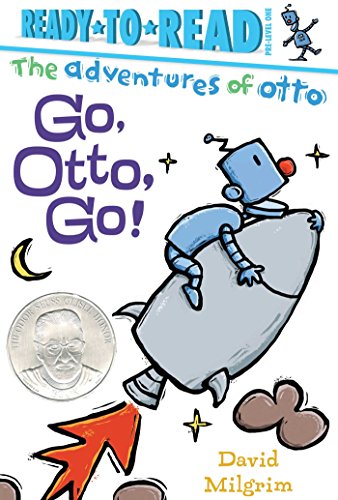 |
| Go, Otto, Go! by David Milgrim |
Yes, the leveling guidelines are important, but the overarching element of importance for Siobhan is whether or not it’s a fun and engaging read for children. “If it’s not fun to read then nothing else really matters.” She says that just like there’s satisfaction in sorting out the puzzle pieces of a beginning reader, it’s a joyful puzzle to choose what to publish with the goal of having a “robust program, but one that ensures that each book is distinct from others on our list and from what’s already out there.”
Of course, I had to ask about beginning reader pet peeves (‘fess up, I’m sure you have a few too!). Siobhan mentioned books that use a beginning reader trim size (6” x 9”) that claim to be a certain level, but have too much text that would intimidate a very beginning reader. Her goal is for readers, no matter their interests or reading level, to come away feeling accomplished. She worries that a text-heavy early level can leave kids frustrated and ultimately turn them off of reading.
 |
| Mitchell is Moving by Marjorie Weinman Sharmat, illus. by Jose Aruego & Ariane Dewey |
It’s easy to see that Siobhan takes great pride in the books her team creates for young readers. “At the end of the day, we’re helping kids learn to read and feel proud of being able to do so, no matter their reading level. And that is a really cool job. It certainly helps this night owl get out of bed every morning!”
Subscribe to:
Posts (Atom)